In the latest version of RFeye Site, our expert-level spectrum monitoring software we have looked at how our customers operate RFeye Site and how we can make it simpler to use for them to use.
In software development time spent talking to customers is always extremely valuable. So that’s exactly what we did. One common theme amongst the customers we spoke to wasn’t to add a raft of new features (although we have added a few that we’ll talk about in the next blog) but to make RFeye Site more intuitive to operate. We looked at how customers performed different functions, the ways they went about achieving tasks, what buttons and icons they used, and ones that were rarely used. As well as observing we also listened. “It would be great if I could select all my Nodes”, “Why do we have icons that look so similar?” “How can I rearrange the order of my Nodes?”
From our observations and interviews with customers, the development team set about improving some of the core functionality with simplicity and commonality as the guiding principles. In version 1.51 of RFeye Site you’ll be able to access all the usability improvements. Here are a few highlights.
All the Windows on screen
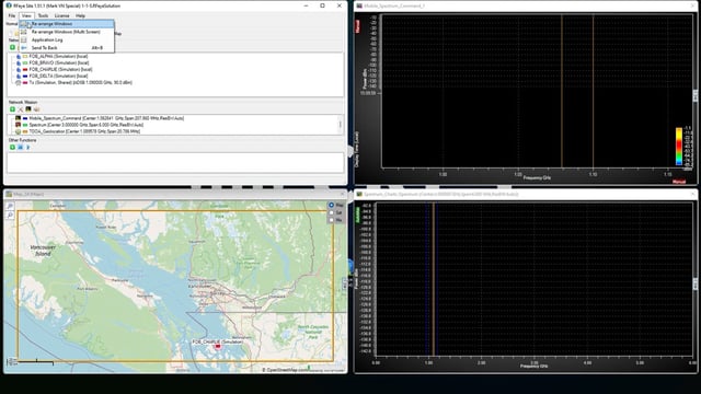
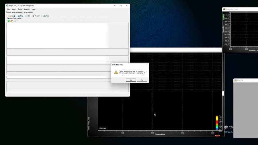
Firstly, when you open RFeye Site, and you are using a solution created by someone else with a different screen set up, you would sometimes get windows opening half off the screen. In the new version, it warns you that some of the windows are out of bounds and ask you if you would like to rearrange them. By clicking “Yes” all the windows appear on the screen.

Tabs, not long lists
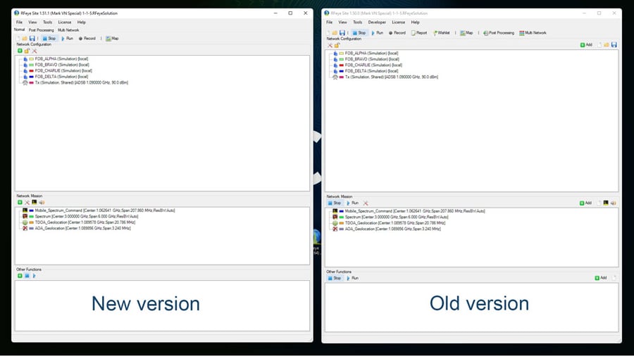
If you install version 1.51 of RFeye Site you immediately notice a cleaner, more streamlined look. All the functionality is still retained but it is now easier to access the functions you need for the task you are trying to perform, without distractions. We have created tabs instead of buttons for “Normal” Realtime processing, Post Processing and for when we are managing Multiple Networks. It is much simpler and quicker to switch between these tabs.

Keyboard Combinations for Greater Control
We have introduced a number of new keyboard and mouse combinations that allow greater flexibility in how you select, change, navigate and control different items within RFeye Site. We’ve listed all the combinations, but everything mentioned in this blog in shown in the video below.
Keyboard Combinations
- Up / Down arrow
- Select item below or above
- Left / Right arrow
- Switches the current selected tab on the tab panel on the right
- Shift + Up arrow / Down arrow
- Additionally select the item above / below the item you have currently selected
- Alt + Up arrow / Down arrow
- Switch selected item(s) with the one above / below it
- Page Up / Ctrl + Up arrow
- Select the first item in the list
- Page Down / Ctrl + Down arrow
- Select the last item in the list
- Ctrl + A
- Select all items
- Ctrl + Left click
- Select multiple items
- Shift + Left click
- Select range of items
- Escape
- Deselect all items
- Delete
- Delete selected items
If you have any questions about RFeye Site or the new functionality, do not hesitate to get in touch.
Video Walkthrough
Watch the video for a quick demonstration of how to use the new features.
